Guest Post by The Jibe.
Having a mobile and tablet-friendly eCommerce website is all about winning micro-moments. The I-want-to-know, I-want-to-go, I-want-to-do, and I-want-to-buy moments. As Google puts it, “…these moments are becoming the new battleground for brands…”.
When a prospect is on the go, and they want to buy something in-store, 82% of them will consult their smartphone first and 91% will use their smartphone for new ideas when they’re in the middle of a task. Is your website ready to win those moments? Is your website optimized for mobile? Will it show up at the top of the search results? Will it convert them once they arrive or will they bounce?
I want to help you win those moments. Here are some tips for designing a mobile and tablet-friendly eCommere website:
Cross-device readiness
1. Make it responsive. This is an absolute must if you want a mobile-friendly site. Making your website responsive allows your content to look great on any (modern) device, browser, or operating system. A responsive website responds to the dimensions of the device that a customer is using to access it and displays the content accordingly.
2. Support true omni-channel. It’s important to distinguish which devices a user was using when they initiated their shopping cart to when they finalized their checkout. If you send them a “Come back and add more to your cart” email with a discount code, and they return using a different device but their items are all gone, they’re likely going to bounce. A study from Barilliance found that 41% of shoppers who finalized their shopping session on a smartphone started on a different device.
Increase your website conversion rate
3. Accept guest checkouts. This is the norm for mobile devices. Make it possible for users to purchase your products without signing up for an account and continue checking out as a guest. It’s best to keep the distractions and checkout steps to an absolute minimum.
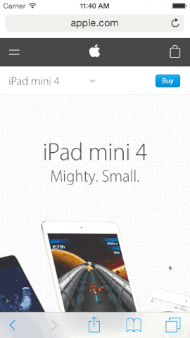
4. Sticky ‘call to action’ buttons. Make it simple for your customer to convert at any given time along the buyer journey. Include sticky CTA buttons (Add to Cart, Checkout, Buy Now, etc.) on the bottom and/or top of your product, shopping cart, and checkout pages. Look, even Apple does it:
5. “Customers who bought this also bought…” Upsell and cross-sell on your product pages, site searches, and shopping carts to introduce your customers to more products to increase your average dollars per transaction. If you had any doubts about this tactic, Amazon reports that 35% of their business comes from cross-selling.
6. Practice shipping transparency. Be upfront about shipping and handling right at the onset of the transaction. Surprise shipping costs at the end of the checkout can make or break the sale. Everyone appreciates transparency – and free shipping when possible!
7. Personalization based on geolocation. Personalization is super helpful for global brands that market to different geographic locations and climates. Deliver personalized content to individuals in their respective locations. Think winter boots for Suzy from Saskatoon browsing your footwear store mid-December or flip-flops for Fred from Florida perusing your products online mid-July.
Create a design-centric mobile experience
8. Seamless imagery. Nothing’s worse than when you discover a landing page, and their product images are skewed, pixelated, or worse, non-existent because they’re not optimized for mobile. Ensure your images are mobile-ready; make it easy to browse galleries and click to expand – consider lazy load.
9. Analyze the buyer journey. It’s imperative that you understand how a user interacts with your site and the steps they take before making a purchase. Create buyer personas, create customer journey maps, check your analytics to watch for drop-off points, and identify pages with high bounce rates. Equipped with this data, you can design an optimized flow and UX for your prospects, guiding them through the buyer journey with subtle design cues and interactions that help them find what they’re looking for.
10. Easily accessible contact info. Make things obvious for the customer and try not to assume anything. Include easy-to-see contact information (phone number link, contact email, feedback form, live chat, etc.) in hi-vis locations.
11. A/B test. If you have sufficient traffic, A/B test. There is no perfect design, but you can perfect it incrementally through testing what works and what doesn’t. Analyze button color, button placement, specific wording, CTA buttons, images, and even entire pages. Tools like VWO, Optimizely, and User Testing make this part of your life easier.
This just scratches the surface of building an optimized, micro-moment-winning mobile website. What other tips would you suggest? Let me know in the comments or reach out to me at The Jibe, a web design and development agency specializing in mobile eCommerce design – [email protected].
 About the author
As a co-founder of the Vancouver-based agency The Jibe, Francis Pilon has had the opportunity to work with well-known brands such as Mac’s Convenience Store, Sutton Realty Group, Grouse Mountain, and more, but also with smaller eCommerce clients such as Banyen Books & Sound, Umeboshi, and ArtsALLY. As a co-organizer of the eComVan Meetup, he is always keen on sharing his experience with the community.